From Hell to Prosperity

A graphic showing striking disparities income among religions in America, from the NYT Magazine:

Bill switched from childhood Methodist to adult Episcopalian in an attempt to boost income. Did that likely work?

Barro and McCleary 2006 argue the relationship goes from income to religiosity (as measured by church attendance, personal prayer, and belief in hell and the afterlife). At least for the Protestant denominations, the ones on the left mostly feature more religiosity in these senses than the ones on the right.

Barro and McCleary analysed the relationship going the other way also, and found that Belief in Hell raised your economic growth potential.

Another study found that college students who believed in a vengeful, angry God were less likely to cheat on a test than those who believed in a kindly, forgiving God. And of course we know from other literature that trustworthy behavior is associated with more opportunities to trade, and thus more prosperity.

A different twist than the Protestant Ethic: Scared Rich?

Read More & Discuss

Inception Statistics

We’ve had a lot of very heated debates on this blog about the uses and abuses of global statistics—most recently on estimates of poverty, maternal mortality, and hunger—with a certain senior Aid Watch blogger inciting the ire of many (not least those who produce the figures) by calling them “made-up.”

A new study in the Lancet about the tragic problem of stillbirths raises similar questions: If stillbirths have been erratically and inconsistently measured in the past, especially in poor countries with weak health systems, what then are these new numbers based on?

Of the 193 countries covered in the study, the researchers were able to use actual, reported data for only 33. To produce the estimates for the other 160 countries, and to project the figures backwards to 1995, the researchers created a sophisticated statistical model. {{1}}

What’s wrong with a model? Well, 1) the credibility of the numbers that emerge from these models must depend on the quality of “real” (that is, actual measured or reported) data, as well as how well these data can be extrapolated to the “modeled” setting ( e.g. it would be bad if the real data is primarily from rich countries, and it is “modeled” for the vastly different poor countries – oops, wait, that’s exactly the situation in this and most other “modeling” exercises) and 2) the number of people who actually understand these statistical techniques well enough to judge whether a certain model has produced a good estimate or a bunch of garbage is very, very small.

Without enough usable data on stillbirths, the researchers look for indicators with a close logical and causal relationship with stillbirths. In this case they chose neonatal mortality as the main predictive indicator. Uh oh. The numbers for neonatal mortality are also based on a model (where the main predictor is mortality of children under the age of 5) rather than actual data.

So that makes the stillbirth estimates numbers based on a model…which is in turn…based on a model.

Showing what a not-hot topic this is, most of the articles in the international press that covered the series focused on the startling results of the study, leaving aside the more arcane questions of how the researchers arrived at their estimates. The BBC went with “Report says 7,000 babies stillborn every day worldwide.” Canada’s Globe and Mail called stillbirths an “epidemic” that “claims more lives each year than HIV-AIDS and malaria combined.” Frequently cited statistics included the number of stillbirths worldwide in 2009 (2.6 million), the percentage of those stillbirths that occur in developing countries (98%), the number of yearly stillbirths in Africa (800,000), and the average yearly decline in stillbirth over the period studied (1.1 percent since 1995).

Only one international press article found in a Google search, by AP reporter Maria Cheng, mentioned the possible limitations of the study’s estimates. Not coincidentally, that article interviewed a source named Bill Easterly.

Despite the disinterest of the media, this is a serious problem. Research and policy based on made-up numbers is not an appealing thought. Could the irresponsible lowering of standards on data possibly reflect an advocacy agenda rather than a scientific agenda, or is it just a coincidence that Save the Children is featured among the authors of the new data?

[[1]]From the study: “The final model included log(neonatal mortality rate) (cubic spline), log(low birthweight rate) (cubic spline), log(gross national income purchasing power parity) (cubic spline), region, type of data source, and definition of stillbirth.” [[1]]


Read More & Discuss

Finally, the definitive guide to creatively manufacturing your own research result

From the brilliant xkcd (also the creator of this classic in statistics humor).

We couldn’t resist using this as a way to illustrate some of our early wonky posts complaining about the suspected practice of “data mining” in aid research.

In aid world, research looks for an association of some type between two factors, like economic growth and foreign aid. But since both growth and aid contain some random variation, there is always the possibility that an association appears by pure chance.

“p < .05” is our assurance from the researchers that the probability that their result came about by coincidence is less than 1 in 20, or 5 percent, which is the accepted standard.

But the aid researchers—like the jelly bean scientists—are eager to find a result, so they may run many different tests. The problem, as Bill explained it, is that:

The 1 in 20 safeguard only applies if you only did ONE regression. What if you did 20 regressions? Even if there is no relationship between growth and aid whatsoever, on average you will get one “significant result” out of 20 by design. Suppose you only report the one significant result and don’t mention the other 19 unsuccessful attempts.…In aid research, the aid variable has been tried, among other ways, as aid per capita, logarithm of aid per capita, aid/GDP, logarithm of aid/GDP, aid/GDP squared, [log(aid/GDP) - aid loan repayments], aid/GDP*[average of indexes of budget deficit/GDP, inflation, and free trade], aid/GDP squared *[average of indexes of budget deficit/GDP, inflation, and free trade], aid/GDP*[ quality of institutions], etc. Time periods have varied from averages over 24 years to 12 years to to 8 years to 4 years. The list of possible control variables is endless….So it’s not so hard to run many different aid and growth regressions and report only the one that is “significant.”

And the next thing you know, there’s a worldwide boycott of green jelly beans…

UPDATE by Bill 12 noon: I asked around some journalist contacts of Aid Watch at leading newspapers how much awareness of this problem there is in the media, and got a fairly clear answer of ZERO.

Read More & Discuss

Does growth reflect good and bad dictators, or just good and bad statisticians?

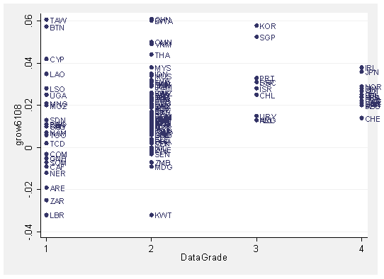
As a previous post showed, autocracies have high variance of growth outcomes (also illustrated in the graph above). The usual interpretation is that benevolent autocrats cause good outcomes while malevolent autocrats cause bad growth outcomes.  Democracy has checks and balances that prevents malevolent people from having too much power to generate bad outcomes, but also restrains the good ones from doing what they want to achieve the great outcomes.

Unless this is completely wrong. Autocracy is only one dimension of society, after all, and is heavily correlated with other dimensions that could cause high dispersion of development outcomes, such as dependence on commodity exports, dependence on agriculture, civil wars, and ... BAD STATISTICIANS (?!)

Bad statisticians make a lot of measurement mistakes. Average growth over 1960-2008 might have zero mistake ON AVERAGE, but there will randomly be some countries with a string of exaggerated growth rates. Other countries will randomly have a string of underestimated growth rates. So the variance of growth will be higher the worse the data quality -- which is exactly what we see in the picture.

Of course, I am not saying China or Singapore or Taiwan have high growth (and Liberia has horrible growth) ONLY because of measurement error. Other indicators confirm the East Asian booms -- but are we really sure growth was 6 percent per capita per year, instead of 4 percent per capita per year?

How bad is bad quality data? Alwyn Young at LSE has a fascinating recent paper in which he points out:

although the on-line United Nations National Accounts database provides GDP data in ...constant prices for 47 sub-Saharan countries for each year from 1991 to 2004, the UN statistical office which publishes these figures had, as of mid-2006, actually only received data for just under half of these 1410 observations and had, in fact, received no constant price data, whatsoever, on any year for 15 of the countries for which the complete 1991-2004 on-line time series are published.

So for 15 African countries, "bad quality data on real GDP growth" really means "NO data on real GDP growth".

Next time you are praising an autocrat for a glorious growth record, remember you may really just be praising an incompetent statistician.

Read More & Discuss

Twitter and Income Distribution

UPDATE 11:35am: don't think I obsess about Twitter numbers (see end of post)

I posted a link on Twitter to yesterday's great post by Laura: "Does Japan need your donation?". A little while later the traffic on Aid Watch exploded. Being still pretty clueless about social media, I didn't know why. Much later in the day, the reason became apparent -- it had made it into @TopTweets Favorites, which I had never heard of  but apparently has, oh, 1, or 2, or a million followers.

An aggregator like @TopTweets picks out what is already getting noticed and then makes it a LOT more noticed, makes it "famous for being famous."

Aid Watch was reasonably underwhelmed by the experience but did think -- there must be a development lesson here somewhere...

Indicators of human ability like IQ follow a bell curve - a normal distribution (as do other human attributes like height). But income distribution does NOT follow a bell curve. As a previous post noted, under the bell curve the top 1% of American men are more than 6 foot 4 inches tall. Under the distribution that income actually follows, the tallest 1 percent would be more than 46 feet tall! (14 meters).

One possible story is that income is partly driven by aggregators like @TopTweets. Twitter Fame itself is bankable, as Paris Hilton (3.6 million followers) could tell you. So is a lot of other fame.  The top authors, doctors, lawyers, investment bankers, movie-makers,musicians etc. keep getting recommended and re-recommended and get very noticed and very rich (assuming also that they can keep expanding their business with their fame).  Other of only slightly lesser talent never quite make the cutoff to explode into 46-foot-tall-land.

UPDATE 11:35am: don't think I obsess about Twitter numbers.... Wow, @TopTweets boosted me over 12,000 followers! Oh, #$%^&!, still 7,600 to go to catch up to @jeffdsachs.  And he probably doesn't even do his own Twitter account....

Read More & Discuss

The World According to USAID

Higher resolution file here.

This animated cartogram, created  by William and Mary student Ashley Ingram and blogged by Mike Tierney at AidData’s The First Tranche, shows aid flows from the US government to the rest of the world from 1985 to 2008.

To produce these maps, the geographic area of a country is replaced by the dollar value of its aid, so that the size of a country fluctuates from year to year depending on how much money the US sends it for development assistance. At the same time, the countries are shaded lighter or darker according to per capita income levels.

Read More & Discuss

Third World America

UPDATE 11:20AM: accused of Detroit "poverty porn", see response below. As you may have noticed, this blog sees America itself as an interesting development laboratory. Others seem to agree, as a new report applies the Human Development Index to the US.

The site has a cool mapping function. Here is a map of health that locates Third World America in the Deep South and its borderlands.

The South as Third World holds up controlling for race and gender, as the same area shows the highest concentration of white females with less than high school education.

Of course, in metro areas we have an inner city Third World hiding in plain sight.  Here is Detroit for example, right next to "First World" Pontiac:

Commenters accuse Aid Watch of some kind of "poverty porn" on Detroit.

OK, I already apologized for my catastrophic bonehead mistake of carelessly applying the label "downtown" to the negative picture (now removed).

As further recompense, here is a nice happy positive picture of the real "downtown Detroit." Unfortunately, I have to stick by the original characterization of much of Detroit as belonging to the "Third World" part of America, based on all the evidence on unemployment, poverty, etc. that I have examined in detail. It's going to take more than a few happy pictures to fix that.

Have fun on your own exploring Third World America on this great site.

Read More & Discuss

Where the money goes, Egypt edition

UPDATE 12:24 PM: US Aid here refers to Official Development Assistance, not military aid. See US military vs economic assistance  and US aid by sector in Egypt here.

This chart comes to us from the people at AidData, a data portal that provides detailed information down to the individual project level for aid funds spent by traditional and non-traditional donors.

The categories used are from research by Simone Dietrich, who explained: "Public sector captures US aid flows to Egypt that directly involve the Egyptian government in the implementation, ranging between budget support and technical assistance. Bypass aid, on the other hand, captures aid that flows 'around' the Egyptian government and is implemented by multilateral organizations, NGOs, or private contractors. "

So, has US aid been better at supporting the Egyptian government, or the Egyptian people?

Read More & Discuss

Cool maps: Measuring growth from outer space

For many of the world's poorest countries, figures measuring economic growth are unreliable, and in some cases they don't exist at all.  In an NBER working paper, Brown University professors J. Vernon Henderson, Adam Storeygard, and David N. Weil came up with an interesting proxy for GDP growth: the amount of light that can be seen from outer space.

Of course, the light intensities pictured in this world map reflect both income and population density. The authors explain:

In the United States, where living standards are fairly uniform nationally, the higher concentration of lights in coastal areas and around the Great Lakes reflects the higher population densities there. The comparison of lights in Western Europe and India reflects huge differences in per capita income, as does the comparison between Brazil and the Democratic Republic of Congo.

While GDP figures are almost always reported at the national level, the night lights allow us to see the growth of cities and regions too. The lights may be better able to show activity in the informal economy, and can be captured far more frequently, and with less of a time lag, than GDP figures.

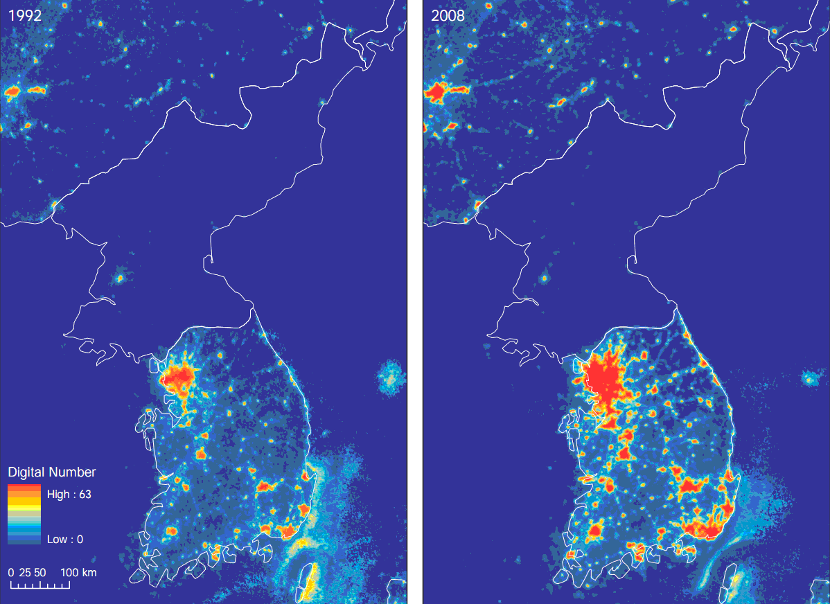
Growth in light intensity not only "gives a very useful proxy for GDP growth over the long term;" the authors also found that it "tracks short term fluctuations in growth." One example shows the dramatic contrast in long term growth between North and South Korea, and gives a picture of how quickly South Korea has developed over the last two decades:

Another example illustrates how genocide literally darkened Rwanda in 1994:

Read More & Discuss

Eternal sunshine of the useless charts

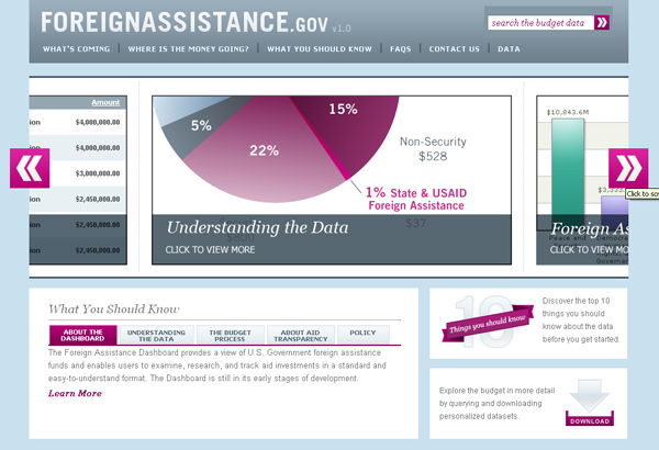
After all the blogging we’ve done on how hard it is to find complete and accurate information (as opposed to “success stories”) on USAID’s website, I think we’d be remiss not to mention a new US government site launched just before the holidays. The Foreign Assistance Dashboard is the first version of a site that will someday allow users to create charts and tables showing where and how well US aid funds have been spent.

On the plus side, it looks good, makes pretty charts, and it’s easy to use. In future iterations, US officials have said that it will publish data in an internationally comparable format. (This is important so that recipient countries, which receive aid from so many different donors, can get a full picture of aid inflows.)

The page on Pakistan tells us, for example, that $3 billion has been requested from Congress for Pakistan in 2011; $1.6 billion of that is for “Peace and Security,” and most of that is specifically for “Stabilization Operations and Security Sector Reform.”

On the minus side, it’s missing most of the information that actually matters to anyone tracking where the money goes and measuring its impact. The country information pages are incomplete because they exclude funds allocated to regional offices rather than country offices. And, as you can see from the below chart, the site has only data from USAID and State, and only shows appropriated amounts, not what has actually been spent.

While I admire the guts it took to publish such an aspirational matrix, I fear the day may still be far away when we will see a nice row of Xs in that last performance data column. Still, a recent editorial from transparency guru Owen Barder reminds why that is a goal worth pushing for:

The shift to a global information standard for aid sounds a rather dull and technocratic change, but a common standard for sharing information unlocks a world of possibility. It will enable the information from multiple aid agencies to be easily used by governments, parliaments and citizens in donor and developing nations.

It democratises aid, removing the monopoly of information and power from governments and aid professionals. It inspires innovation and informs learning. It reduces bureaucracy. It also makes it possible for communities to collaborate, for citizens to hold governments to account and for the beneficiaries of aid to speak for themselves.

Read More & Discuss

Instead of the Iron Curtain, the Facebook Curtain

This map shows the pattern of Facebook friendship links across places around the world, with lots of white where there are very dense links across nearby places. The map was created by a Facebook intern, and I learned about it (where else?) on Facebook (HT Mari Kuraishi).

One interesting pattern is a kind of Facebook Curtain somewhat related to the old Iron Curtain. The whole area including the former Soviet Union and China, along with other adjacent autocracies like Burma and North Korea, is pretty much a Facebook void (see zoomed map below). This reflects some combination of language barriers, preference for other social networks in Russia and China, and some (rather unclear) role for Internet censorship by the authorities, which either prevents or lowers the payoff to participating in Facebook.

Read More & Discuss

Human Development Index Debate Round 2: UNDP, you're still wrong

by Martin Ravallion, Director of the Development Research Group at the World Bank

Francisco Rodriguez has defended the HDI against recent criticisms by Bill Easterly and Laura Freschi, who drew in part on my new paper, “Troubling Tradeoffs in the Human Development Index.”

Francisco would make a good lawyer, since he defends his case vigorously on multiple fronts. But this leaves a puzzle about his true position. On the one hand he claims that tradeoffs—including the implied monetary valuations of extra longevity and schooling—are not relevant to the HDI, and that it is even “incorrect” to calculate them. But (on the other hand) he agrees that the old HDI was deficient because it assumed constant tradeoffs (perfect substitution). If he does not care about the HDI’s tradeoffs then why does he care about how much substitution is built into the index, which is all about its tradeoffs?

The tradeoff built into any composite index is just the ratio of the (marginal) weight on one of its underlying variables (such as longevity in the HDI) to another (such as income). There is nothing “incorrect” in wanting to know the HDI’s weights and implied tradeoffs. These are key properties for understanding and assessing any composite index.

And the implicit weights and tradeoffs in the new HDI are questionable. I find that the HDI’s valuations of longevity in the new HDI vary from an astonishingly low $0.51 for one extra year of life expectancy in Zimbabwe to $8,800 in Qatar. The valuations are lower than for the old HDI, especially in poor countries.

And this striking devaluation of longevity is not just due to the fact that the HDI puts declining marginal weight on income, as Francisco suggests. As my paper shows, the weight on longevity itself has declined due to the change in methodology, and substantially so in poor countries.

Francisco defends the new HDI on the grounds that it allows imperfect substitution between its components. This is a non sequitur. One can introduce imperfect substitution without the questionable features of the new index. Indeed, I showed in my paper that if the HDI had used instead the Chakravarty index—a simple generalization of the old HDI, with a number of appealing properties—it could have relaxed perfect substitution in a less objectionable and more transparent way.

I agree with Francisco that perfect substitutability was a dubious feature of the old HDI, and (as he points out) the index was criticized from the outset for this feature. It is a shame that it took 20 years for the Human Development Report to fix the problem. And it is an even bigger shame that the proposed solution brought with it new concerns.

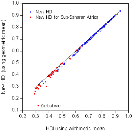
One such concern is the substantial downward revision to the HDI for many countries in Sub-Saharan Africa (SSA), which Easterly and Freschi pointed out. Francisco questions their claim, but the data are not on his side. The graph shows the pure effect of the change in the HDI’s aggregation method. (I have held everything else constant, at the same data used by the 2010 HDI.) Switching to the geometric mean involves a sizeable downward revision for countries with low HDIs, and these are disproportionately found in SSA.

This is not to deny that much of SSA is lagging in key dimensions of development, as Francisco notes. The point here is to separate the role played by the questionable new methodology used by the HDI.

Maybe it is time to go back to the drawing board with the HDI. Deeper consideration of what properties the index should have—especially its tradeoffs—would be a good way to start.

--

Related posts: The First Law of Development Stats: Whatever our Bizarre Methodology, We make Africa look Worse What the New HDI tells us about Africa Human Development Index Debate Round 2: UNDP, you’re still wrong

Read More & Discuss

What the New HDI tells us about Africa

by Francisco Rodríguez, Head of Research at the Human Development Report Office In a post published last Thursday, Bill Easterly and Laura Freschi criticize the new formula for the Human Development Index (HDI) introduced in this year’s Human Development Report.  Borrowing on a recent paper by the World Bank’s Martin Ravallion, Easterly and Freschi argue that our decision to shift from an additive to a multiplicative mean makes Africa look much worse than it should.

The relevant question, of course, is not whether the index makes any particular region or country look better or worse but whether the methodological changes introduced in the new version of the HDI make sense.  If we reject the methodology, we should do it based on the soundness of its principles, not on whether or not we like its conclusions.

Why the HDI has a new functional form – and what it means

One of the key changes to the HDI functional form introduced in this year’s report was to shift from an arithmetic to a geometric mean, thus introducing imperfect substitutability into the index. Imperfect substitutability means that the less you have of something, the more you will benefit from improvements in that dimension. By contrast, perfect substitutability (which had characterized the index’s old formula) means that how much you care about one dimension has nothing to do with its initial value. The old perfect substitutability assumption had been extensively criticized, with good reason.{{1}}

Easterly and Freschi misinterpret the rates of substitution in the HDI as saying something about the “value” of a life.  But the HDI is not a utility function, nor is it a social welfare function.  It is an index of capabilities.{{2}}  What the huge differences in trade-offs between health and income in the index tell us is actually something quite simple: that income contributes very little to furthering capabilities in rich countries.  Societies may and do value other things than their capabilities, so it is incorrect to read these numbers as “values” of anything.

For more on why it is incorrect to read “values” into the HDI, read the longer version of this article.

Does the new HDI make Sub-Saharan Africa look worse?

What is the net effect of the new functional form on the relative position of Africa vis-à-vis the rest of the world?  In the 2010 Human Development Report, Africa’s average HDI stands at .389, or 62.3 percent of the world HDI.  If we had applied the old functional form, then Africa’s HDI would have been 64.1 percent of the world average.  So does the new HDI make Africa look worse?  Yes, exactly 1.8 percentage points worse.  While one can of course try to make a big deal about that, as Easterly and Freschi do picking up on the former’s earlier complaints about the MDGs, it seems that nothing in the general picture of Africa’s relative progress vis-à-vis the rest of the world really changes from the new functional form.

Easterly and Freschi also object to the HDR’s measure of progress, which they claim is biased against Africa.  First of all, it is not clear that it would be a good thing if a measure of progress ranked Africa highly for the past forty years, a period that includes the disastrous 1980s.  But if they were right and our measure was incapable of capturing African progress, then we shouldn’t see Africa do well in any period.  However this is not the case. Indeed using the same measure of progress, Africa does remarkably well since 2000.  As  shown in Table 1 below, Africa has six of the top 10 performers in the world, including all the top five (Rwanda, Sierra Leone, Mali, Mozambique and Burundi). Odd results indeed for an index which by design is claimed to be biased against Africa.

For more on Africa’s human development progress, read the longer version of this article.

References

Desai, Meghnad (1991), ‘Human Development: concepts and measurement’, European Economic Review 35, p. 350–357.

Lind, Niels (2004), 'Values Reflected in the Human Development Index', Social Indicators Research 66, p. 283-293.

Sagar, Ambuj and Adil Najam (1998), ‘The Human Development Index: A Critical Review’, Ecological Economics 25, no. 3, June, p. 249-264.

Sen, Amartya (1980), “Equality of what?”, in S.M. McMurrin (Ed.), Tanner Lecture on Human Values, Vol. I, Cambridge: Cambridge University Press.

UNDP(2010) The Real Wealth of Nations: Pathways to Human Development. New York: Palgrave Macmillan.

[[1]]See, for example, Desai (1991), Sager and Najam (1998), Lind (2004).[[1]] [[2]]For the notion of capabilities and its relationship to the human development approach, see Sen (1980).[[2]] --

Related posts: The First Law of Development Stats: Whatever our Bizarre Methodology, We make Africa look Worse What the New HDI tells us about Africa Human Development Index Debate Round 2: UNDP, you’re still wrong

Read More & Discuss

Americans appalled at how much we spend on aid, want to spend 10 times more

This chart is courtesy of Ezra Klein (h/t @viewfromthecave and @laurenist), who summarizes the results from a new World Opinion Poll. The 848 Americans polled guessed, on average, that the US spends 25 percent of the budget on foreign aid, but opined that the figure should be about 10 percent. The actual number, as you Aid Watch readers probably know, is less than 1 percent. The chart will also be interpreted by many as showing that the US should spend more, since many citizens - who have just demonstrated they have no clue what we are currently doing - theoretically have a tolerance for more spending.

I suspect these polls just suggest that most people have a hard time comprehending very large numbers. In fact, public opinion figures on foreign aid correspond closely to another maligned area of federal spending: space exploration. In a 2007 poll, respondents apparently thought 24 percent of federal spending went to NASA, while the real number is also…less than 1 percent.

If this bit of innumeracy is just a natural human failing, perhaps it is related to what’s known in psychological research as the availability heuristic: when a rare event makes a vivid impression, we overestimate its likelihood. Maybe powerful images of earthquake survivors receiving aid in Haiti or a rocket launch remembered from childhood bias us to think these types of events are more frequent, more costly, or more significant in the context of overall spending, than they really are.

Read More & Discuss

The First Law of Development Stats: Whatever our Bizarre Methodology, We make Africa look Worse

UPDATE: Just received notice of drastic punishment for this post: invited to join HDR 2011 Advisory Panel I’ve complained previously about how design of the UN Millennium Development Goals make sub-Saharan Africa look worse than it really is. Now I realize that UNDP’s new Human Development Report (HDR) does the same thing. Not alleging any conspiracy here, it seems unintentional, but is then not caught because … well we all know Africa is supposed to look terrible.[1]

My HDR education comes from Martin Ravallion, who has a great new paper on the new methodology of the Human Development Index (HDI). (Martin does not mention the Africa angle, but provides the necessary insights described below).

Of course, UNDP has an impregnable position: while their results get huge publicity, the methodology behind the results is interesting to approximately 3 people.  As an avid promoter of hopeless causes, here goes…

The biggest change in method was that the new HDI is a geometric average rather than a normal (additive) average. Geometric average means you multiply the separate indices (each ranging between 0 and 1) for income, life expectancy, and education together and then take the cube root (I know your pulse starts to race here…)

Now, students, please notice the following: if one of these indices is zero, then the new HDI will be zero, regardless of how great the other indices are. The same mostly applies if one of the indices is close to zero. The new HDI has a “you’re only as strong as your weakest link” property, and in practice the weakest link turns out to be very low income (and guess which region has very low income).

So, as Martin noted, the new HDI relative to the old HDI penalizes countries with very low income compared to decent numbers on life expectancy and education. One reason I think this is unintentional is that these are exactly the cases that the HDR used to celebrate! The biggest losers here are Zimbabwe, Liberia, DR Congo, Burundi, Madagascar, Malawi, Niger, and Togo.

Martin makes the “decent life expectancy doesn’t help you if you have low income” point in a different way: the new HDI has vastly different numbers for the value of life between poor and rich countries. Martin had previously made this criticism of the old HDI in a paper published in 1997, which Aid Watch covered in a previous post. The HDR addressed this criticism by making the problem much worse. Previously we were all whining about differences in the value of life of 70 times between rich and poor – now it’s a differential of 17,000 to one. Sorry, Zimbabweans, UNDP thinks your lives are worth 50 cents.

But wait, Africa has another GREAT chance to perform well --  the HDR also gives mucho publicity to the “top movers” in HDI over 1970-2010, ranked in order of percentage increase. My old MDG paper mentioned above said Africa would look better on percentage increases in health or education indicators.  Indeed, Ethiopia, Burkina Faso, Niger, Mali, and Burundia all had more than a 300% increase in educational enrollments (using the UNDP’s own data) from 1970 to 2010.

So naturally, among the champion improvers are … Oman and Nepal … and no sub-Saharan African countries in the top 10. What happened?

In yet another twist, the HDR ranked the top improvers measured as deviations from the average growth in HDI of others at similar initial HDI in 1970. Since almost all of the bottom ranks of the HDI are sub-Saharan African (exacerbated by the above “weakest link” methodology), Africa will only do well if it does better on average than – Africa.

If we forget the deviations thing, and just rank by growth in the HDI from 1970 to 2010, then sub-Saharan Africa would get 6 out of the top 10 improvers.

If you have read this far, you get a medal. So what’s the lesson of all this mumbo-jumbo about methodology? Maybe you could make a case for the new methodology, but at the very least it’s clear that obscure choices of method make a big difference in who you celebrate – and who you make look bad. And way too often, Africa winds up in the latter category.

Postscript: we want to thank UNDP for generously making all their data and methodology available to us even though they knew we were critical, because they also generously gave reactions to a preliminary draft based on an earlier dataset we downloaded from the HDR website. They did not change our minds and the new dataset confirmed our earlier results. But we give them great credit for constructive engagement. The paper that describes their methodology is here.


[1] This post uses the words “Africa” and “sub-Saharan Africa” interchangeably, following common development-speak. North Africa is in a very different situation from that described here.

--

Related posts: The First Law of Development Stats: Whatever our Bizarre Methodology, We make Africa look Worse What the New HDI tells us about Africa Human Development Index Debate Round 2: UNDP, you’re still wrong

Read More & Discuss

Is there evidence for the absence of an aid effect, or is there just absence of evidence?

Aid policy was based on the premise that aid raises growth, but …{a major} study of this question was saying that this premise was false.

This quote refers to the Rajan-Subramanian paper (later published in a peer-reviewed journal) that was unable to reject the hypothesis of a zero effect of aid on growth. As I never tire of pointing out, we often get our conditional probabilities mixed up. Based on standard statistical methodology, the (1) probability of failing to reject the zero effect hypothesis is high when the effect is indeed zero. Unfortunately, the author of the quote incorrectly thinks this implies the opposite probability is high -- (2) the  likelihood that the effect is indeed zero when you fail to reject the hypothesis of zero. This likelihood can actually be quite low even if the first probability is high. Absence of Evidence does not constitute Evidence for Absence.

Who is this nincompoop?

This 2006 quote is from  William Easterly. Oops. Those cognitive biases are even stronger than I thought.

In a desperate bid to save face, there is SOMETHING defensible you can say about the growth effect of aid based on the Rajan and Subramanian paper. They report the standard error of the estimated coefficient of growth regressed on aid (addressing causality), which implies we can say with 95% confidence that the effect lies between -.06 and .18. So we CAN reject the hypothesis that one percentage point of additional aid to GDP raises growth by anything more than 0.18 percentage points.

As it happens, the standard model of aid, investment, and growth (old-fashioned but still in use today in the World Bank, IMF, and UN Millennium Project) implies that aid goes into investment one for one, and then this investment raises growth. With the usual parameters, this would imply an aid effect on growth of 0.2 or higher. THAT model we can reject.

The most honest statement about the modest growth effects is that they are more difficult to discern in the data ONE WAY OR THE OTHER.

Let us all now feel suitably chastened and humbled.

Read More & Discuss

Donors seem to think Democracy is Only for Rich, Not for Poor

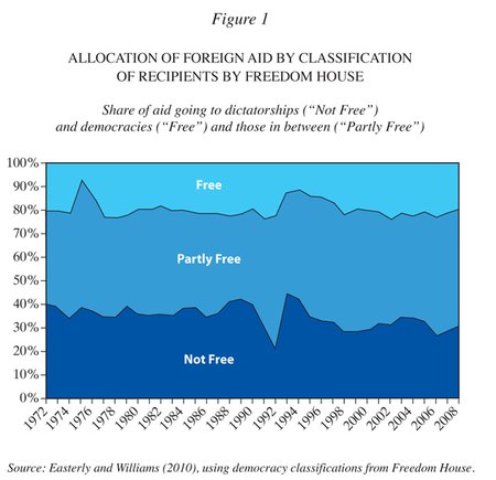
The international aid system has a dirty secret. Despite much rhetoric to the contrary, the nations and organizations that donate and distribute aid do not care much about democracy and they still actively support dictators. The conventional narrative is that donors supported dictators only during the cold war and ever since have promoted democracy. This is wrong.

Mo Ibrahim said:

All Africans have a right to live in freedom and prosperity and to select their leaders through fair and democratic elections, and the time has come when Africans are no longer willing to accept lower standards of governance than those in the rest of the world.

He knows that recognition of democratic values eventually leads to their realization; lack of recognition continues the subjugation of the poor.

See my whole article at the New York Review of Books

Read More & Discuss

Another fake numbers problem on a topic Americans (and NYT) care about even more than world hunger

In the wake of Aid Watch's posts on made up world hunger numbers, the NYT revealed today another scandalous made up numbers problem in another area:

{The methodology} is vilified by professional mathematicians .... {which} turned {the numbers' creators} into the laughingstock of the numbers community.

It is bad enough that one analytical mathematician, the U.C. Irvine professor Hal S. Stern, has called for the statistical community to boycott participation...

{another expert said} “This isn’t a sincere effort to use math to find the answer at all. It’s clearly an effort to use math as a cover for whatever you want to do. ...It’s just nonsense math.”

{Outside evaluators} cannot {fully check the numbers}...because of lack of transparency...Three of the {numbers creators} said the {reporting agency} did not verify the numbers they turned in.

All this fury is directed at a number that Americans DO passionately care about --

college football rankings.

See the full article in the Sports section of the NYT. To my knowledge the NYT  has not run a story on the equally dubious methodology in numbers the NYT reports about areas that we readers apparently care about much less: worldwide maternal mortality, world hunger, and global poverty.

Read More & Discuss

Development: the Greatest Story Ever Told

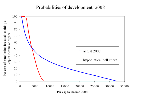
After all the efforts of the last 6 decades, only a minority of countries are developed. That seems like a sad indication that the odds are long as countries struggle to attain Development. Yet let's not take the Development that has been achieved for granted. If you beat the odds, the payoff is remarkably large (which is maybe why all of us are working so hard on Development!) As the figure shows, a third of the sample of countries is at $8000 per capita or better in 2008, and a fifth of the sample is $16,000 per capita or better. In this sample, there is a 1 percent chance of getting all the way to national average income per person of $32,000.

To put it another way, development does NOT follow the bell curve distribution thought to be “normal” for many things (which is why the bell curve is called the “normal” distribution). The hypothetical bell curve in the figure gives you basically ZERO chance of ever getting above $8000.

Another way of illustrating how LARGE the payoff to development is, contrast it with something that does follow a bell curve: human height. American males have an average height of about 5’ 9 ½ inches (1.77 meters). Using the actual bell curve for their height distribution, American males have about a 1 percent chance of being 6’ 4’’ or taller (1.93 meters). But if height followed the same distribution as development, there would be 1 out of every 100 American men taller than 46 feet! (14 meters!). (Try fitting THEM into your family picture.)

The boring technical jargon is that development has a “fat-tailed” distribution. The normal bell-curve distribution is not “fat-tailed” because its right tail in the figure above vanishes quickly, while the development distribution has a right tail, that is, well, Fat.

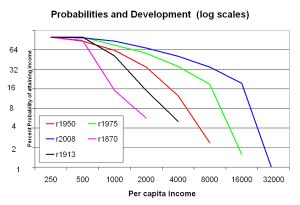
It’s easier to see what is going on with fat-tailed distributions when using log scales, shown in the second figure. With these log scales, every additional movement along the scale is a DOUBLING of the previous level. So move down the “probability” vertical axis, where every step down cuts your probability in half, but at the same time roughly doubles your per capita income payoff.

Moreover, the graph shows the distribution at different points in time: 1870, 1913, 1950, 1975, 2008. The payoffs keep getting better for the same probability. Or to say it another way, as you move from 1870 to 2008, the attainment of higher and higher per capita income levels becomes more likely. In fact, the definition of what income level represents “Development” has to keep changing because the whole distribution is moving to the right.

So first the bad news and then double good news. The bad news is that the odds are long to attain “Development.” The double good news is that (1) the Development prize is remarkably Large, and (2) it keeps getting Larger.

From Greek myths to Hollywood romances, we all love the story of the Hero who overcomes long odds to attain a Remarkable Prize (the Golden Fleece, the woman of my dreams, etc.)

Development then should also be one of the greatest stories ever told.


Wonky footnotes: I am obviously leaving out a lot of necessary details and further discussion. Two famous fat-tailed distributions in statistics are the log-normal and the Pareto. The Pareto distribution would show up in the second figure as downward sloping lines that are exactly straight (which are called Power Laws, a topic which has a huge literature and generates wild excitement in some quarters). Income per capita across countries appears to follow more the log-normal distribution. I am more interested in development being fat-tailed than in whether it is following exactly a Power Law. Countries dominated by oil income are omitted from the distributions. The source for the per capita income data is Angus Maddison, updated to 2008 with WDI. It goes without saying that per capita income numbers are shaky (and even more so as you go back in time), but I think the qualitative story is probably mostly right despite shaky individual numbers.

Read More & Discuss